
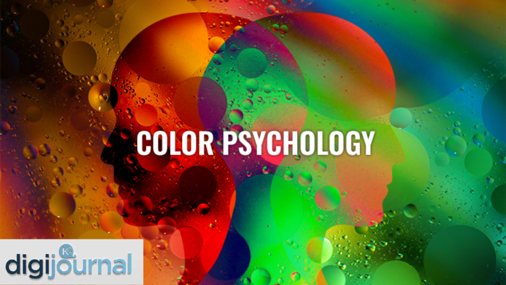
Well, here’s something that might just blow your mind — did you know that the colour of a room can actually change how hungry you feel? Or that the shade of a button on a website can decide whether someone clicks it or not? That’s the incredible power of colour psychology, a field that explores how colours influence human emotions, thoughts, and behaviours. From the clothes we wear to the logos of global brands, colours are quietly working behind the scenes, shaping our decisions more than we realise.
Colour psychology isn’t just for artists or designers. It’s a deeply relevant science that touches every corner of life — education, healthcare, marketing, interior design, and even personal wellness. Understanding how colours affect us psychologically can genuinely transform the way we see and interact with the world. So, let’s dive headfirst into this fascinating subject and uncover what every shade is really telling us.
What Is Colour Psychology?
At its core, colour psychology is the study of how colours affect human perception and behaviour. It’s a branch that sits comfortably at the intersection of psychology, art, and neuroscience. Researchers in this field examine why certain colours make people feel calm, excited, sad, or even hungry — and how those feelings differ across cultures and contexts.
Colour psychology has roots going back centuries. Ancient Egyptians used coloured minerals and gems in healing practices, believing that different hues carried different energies. Today, the science is far more sophisticated, backed by controlled studies and real-world applications. Though some areas remain open to debate, the general consensus among researchers is clear: colour matters — a lot.
It’s important to note, though, that colour perception is not one-size-fits-all. Individual experiences, cultural backgrounds, and even age can alter how a person responds to a particular colour. That said, broad patterns exist, and understanding them is genuinely useful.
The Psychological Power of Warm Colours
Warm colours — reds, oranges, and yellows — are often described as energetic, passionate, and attention-grabbing. They tend to evoke feelings of warmth, excitement, and urgency.
Red is perhaps the most psychologically powerful colour of all. It raises the heart rate, stimulates appetite, and is closely associated with danger, love, and passion. That’s why you’ll find red in stop signs, fire engines, and romantic Valentine’s Day cards alike. In marketing, red creates urgency — think of those “SALE” banners that practically jump off the screen.
Orange blends the energy of red with the cheerfulness of yellow. It’s enthusiastic, friendly, and creative. Brands that want to feel approachable and innovative often lean on orange. It’s also associated with warmth and endurance, which is why it’s popular in sports branding.
Yellow is the colour of sunshine and optimism. It grabs attention faster than any other colour and is strongly linked to happiness and mental stimulation. However, too much yellow can cause anxiety or visual fatigue — it’s a colour that works best in moderation. Interestingly, babies tend to cry more in yellow rooms, which just goes to show that even the most cheerful colour has its shadowy side.
The Calming World of Cool Colours
On the opposite end of the spectrum, cool colours — blues, greens, and purples — tend to have a soothing, calming effect. They’re often associated with trust, nature, and tranquillity.
Blue is consistently ranked as the world’s most popular colour, and it’s no coincidence. Blue lowers blood pressure, slows the heart rate, and promotes feelings of calm and trust. It’s no wonder that banks, healthcare providers, and social media platforms (think Facebook, Twitter, and LinkedIn) rely heavily on blue. It says, “You can count on us.”
Green connects us to nature and growth. It’s restful on the eyes and strongly linked to feelings of balance, harmony, and health. Green is also associated with prosperity — particularly in Western cultures, where money is literally green. Hospitals and schools frequently use green in their décor for its calming and refreshing qualities.
Purple has long been the colour of royalty, mystery, and spirituality. It combines the calm of blue with the energy of red, creating a sense of luxury and creativity. Lighter purples, like lavender, promote calm and nostalgia, while deeper purples feel richer and more sophisticated.
Colour Psychology in Branding and Marketing
Oh, this is where things get really exciting! Colour psychology plays an enormous role in how brands connect with consumers. Studies suggest that up to 90% of snap judgments made about products can be based on colour alone. That’s not just impressive — it’s a game-changer for businesses.
Here’s a quick look at how some well-known brand colours align with psychological principles:
| Brand Colour | Associated Feeling | Example Brands |
| Red | Urgency, excitement, appetite | Coca-Cola, McDonald’s, Netflix |
| Blue | Trust, reliability, calm | Samsung, PayPal, Ford |
| Green | Health, nature, growth | Starbucks, Whole Foods, John Deere |
| Yellow | Optimism, energy, warmth | IKEA, Snapchat, McDonald’s (paired with red) |
| Black | Luxury, sophistication, power | Chanel, Apple, Nike |
| Orange | Creativity, enthusiasm, affordability | Amazon, Harley-Davidson, Fanta |
| Purple | Royalty, wisdom, mystery | Cadbury, Hallmark, FedEx |
Smart marketers understand that choosing the wrong colour can undermine even the best product. A children’s toy brand splashed in black and grey would feel cold and off-putting. Meanwhile, a luxury jewellery brand in bright orange might seem cheap. Colour alignment with brand identity isn’t just smart — it’s essential.
How Colour Psychology Affects Interior Design
Step into a red kitchen and you might find yourself reaching for a snack sooner than planned. Walk into a pale blue bedroom and your eyelids might feel just a little heavier. That’s colour psychology doing its quiet work in interior spaces.
Interior designers have long understood the power of colour in shaping how a room feels and functions. Here are some key applications:
- Bedrooms benefit from cool, muted tones like soft blues, greens, and lavenders, which promote rest and relaxation.
- Kitchens and dining rooms can use warm shades like terracotta, warm yellow, or red to stimulate appetite and conversation.
- Home offices often work well in shades of green or blue, which support focus and reduce stress.
- Children’s rooms are often painted in bright, stimulating colours to encourage creativity and play, though too much stimulation can disrupt sleep.
- Bathrooms in white or pale blue feel clean, fresh, and spacious.
Even the size of a room can be visually altered using colour. Light colours make spaces feel larger and airier, while dark colours create a sense of cosiness and intimacy. That’s a pretty neat trick if you’re working with a small apartment!
Colour and Emotion: What the Science Says
The connection between colour and emotion has been studied extensively, and while there’s genuine complexity involved, some consistent patterns emerge. Here’s a breakdown of how common colours map to emotional states, according to research:
- Red → Excitement, passion, urgency, sometimes aggression
- Blue → Calm, trust, sadness, clarity
- Yellow → Happiness, optimism, anxiety (in excess)
- Green → Balance, growth, envy (“green with envy” isn’t just a saying)
- Purple → Creativity, wisdom, mystery
- Orange → Enthusiasm, warmth, caution
- Black → Power, sophistication, grief
- White → Purity, simplicity, cleanliness
- Pink → Compassion, romance, femininity (though this association is culturally constructed)
- Brown → Stability, earthiness, reliability
It’s worth noting that context matters enormously. Red in a festive Chinese wedding is a symbol of joy and good fortune, while in some Western contexts it signals danger. Colour psychology must always be understood in relation to cultural norms and personal associations.
Colour Psychology in Education and Child Development
Here’s something worth paying attention to — the colours surrounding children during their formative years can have a meaningful impact on their learning and emotional development. Schools and educators are increasingly aware of this.
Research suggests that:
- Yellow and orange classrooms can boost enthusiasm and creativity in younger children.
- Blue and green environments help older students concentrate and retain information.
- Bright, high-contrast colours stimulate engagement and curiosity in early childhood settings.
- Overly stimulating or chaotic colour schemes can increase restlessness and reduce focus.
Some progressive schools have redesigned their classrooms with colour psychology in mind, using different hues for different purposes — calm colours in reading corners, energising shades in art rooms, and neutral tones in examination halls. The results have been encouraging, with students reporting better moods and improved concentration.
Cultural Differences in Colour Perception
One of the most fascinating dimensions of colour psychology is how dramatically colour meanings can shift across cultures. What feels uplifting in one part of the world might carry grief or warning in another.
Consider the following:
- White is associated with purity and weddings in Western cultures, but in many East Asian cultures, it is the colour of mourning.
- Red signals danger in many Western contexts but represents luck, prosperity, and celebration in China and India.
- Green has positive associations in many Western nations but can symbolise disease or infidelity in some regions.
- Yellow is sacred and royal in China but can signify cowardice in the United States (“yellow-bellied”).
- Black is the colour of formal mourning in most Western countries, while purple fills that role in some parts of Latin America.
This cultural complexity is something that global brands must navigate carefully. A campaign that resonates beautifully in one country could cause genuine offence or confusion in another — all because of colour choices. The takeaway?
Colour Therapy: Healing Through Hues
While it remains outside the mainstream of conventional medicine, it has a rich history and a growing body of enthusiastic practitioners.
Some commonly explored applications include:
- Blue light therapy for treating seasonal affective disorder (SAD) and sleep disorders
- Red light therapy for stimulating cellular repair and reducing inflammation
- Green environments used in hospitals to reduce patient anxiety
- Pink (Baker-Miller Pink) used experimentally in prisons to reduce aggression — with mixed but intriguing results
It’s fair to say that while chromotherapy in its more extreme forms lacks robust scientific backing, the general principle — that colour affects mood and wellbeing — is well-supported. Many therapists incorporate colour awareness into their environments and practices, even if they don’t call it “colour therapy” outright.
Practical Tips for Using Colour Psychology in Everyday Life
Now that we’ve covered the theory, let’s get practical. Colour psychology isn’t just for designers and marketers — it’s something anyone can apply to improve their daily life. Here are some actionable ideas:
At home:
- Paint your bedroom a soft blue or sage green to improve sleep quality.
- Add yellow accents to your workspace to boost creativity and energy.
- Use earthy tones in living spaces for warmth and a grounded feeling.
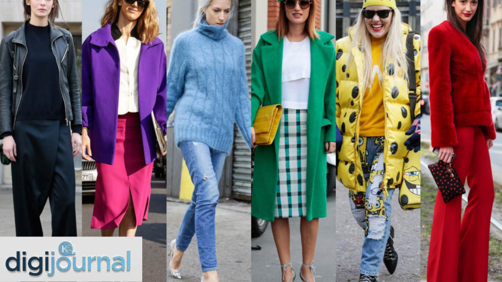
In wardrobe choices:
- Wear blue to job interviews to project trust and competence.
- Choose red for presentations or events where you want to command attention.
- Opt for green when you want to feel calm and balanced throughout a long day.
In digital design:
- Use high-contrast colour combinations for readability and accessibility.
- Choose call-to-action button colours (like orange or red) that stand out from your page background.
- Avoid using colour alone to convey critical information — always pair it with text or icons for accessibility.
For wellbeing:
- Spend time in green, natural environments to reduce stress and boost mood.
- Limit exposure to harsh blue light from screens in the evenings to protect sleep.
- Decorate your meditation or relaxation space with cool, muted tones.
Conclusion
In a world overflowing with visual noise, colour psychology offers a remarkably powerful lens through which to understand human behaviour. Colours aren’t just decoration — they’re communication. They’re emotion in visual form. They influence what we buy, how we feel, where we rest, and even how we learn.
From the bold red of a clearance sale to the serene blue of a hospital ward, every colour choice carries psychological weight. And the good news? Once you understand the principles of colour psychology, you can use them intentionally — to design better spaces, communicate more effectively, and even improve your own emotional wellbeing.
So the next time you pick up a paint brush, choose an outfit, or build a brand, take a moment to think about colour — not just what looks good, but what it’s saying. After all, in the language of colour psychology, every shade tells a story worth listening to.
FAQs
What is colour psychology in simple terms?
Colour psychology is the study of how different colours affect human emotions, behaviour, and decision-making. It explores why certain shades make us feel energised, calm, happy, or uneasy, and how those responses can be applied in design, marketing, therapy, and everyday life.
Which colour is best for reducing stress?
Blue and green are widely considered the most effective colours for reducing stress and promoting relaxation. Blue is associated with calm and trust, while green connects us to nature and balance. Both are commonly used in therapeutic and healthcare environments.
Does colour psychology work the same for everyone?
Not entirely. While broad patterns exist — such as red being energising and blue being calming — individual responses to colour can vary based on personal experiences, cultural background, age, and even gender. Cultural context plays a particularly significant role in shaping colour associations.
How does colour psychology affect buying behaviour?
Colour psychology significantly influences consumer choices. Research suggests that colour alone can account for up to 90% of a buyer’s initial impression of a product. Colours like red and orange create urgency, blue builds trust, and green signals health and sustainability — all of which can push purchasing decisions.
Can colour really improve productivity?
Yes, to a meaningful degree. Studies have found that certain colours in a workspace can boost focus and creativity. Blue environments are linked to higher productivity and clarity, while green reduces fatigue and maintains energy levels. Avoiding overly stimulating colour schemes in work areas can also help reduce distraction and support sustained concentration.